Android) CodeLab - Layouts in Jetpack Compose

Modifiers
- Modifiers는 기존 View에서 xml 속성과 유사한 역할을 하는데, 범위별 Modifiers의 유형 안전성은 특정 레이아웃에 사용 가능하고 적용할 수 있는 항목을 검색하고 이해하는데 도움을 준다.
- 함수의 파라미터로 Modifier를 넣어주는 컨벤션을 사용하면 좋다.
- 전체 영역에 clickable 효과를 주고 싶을 때, padding은 clickable 뒤에 적용해주자.
- CompositionLocalProvider : 컴포지션 트리를 통해 암시적으로 데이터를 전달할 수 있다.
@Composable
fun PhotographerCard(modifier: Modifier = Modifier) {
    Row(
        modifier
            .padding(8.dp)
            .clip(RoundedCornerShape(4.dp))
            .background(MaterialTheme.colors.surface)
            .clickable(onClick = {})
            .padding(16.dp)
    ) {
        Surface(
            modifier.size(50.dp),
            shape = CircleShape,
            color = MaterialTheme.colors.onSurface.copy(alpha = 0.2f)
        ) {

        }

        Column(
            modifier
                .padding(start = 8.dp)
                .align(Alignment.CenterVertically)
        ) {
            Text("Alfred Sisley", fontWeight = FontWeight.Bold)
            CompositionLocalProvider(LocalContentAlpha provides ContentAlpha.medium) {
                Text("3 minutes ago", style = MaterialTheme.typography.body2)
            }
        }
    }
}
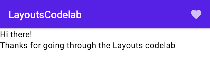
Scaffold
- 가장 높은 수준의 컴포저블.
- Scaffold를 사용하면 기본 Material Design 레이아웃 구조로 UI를 구현할 수 있다.
- TopAppBar, BottomAppBar, FloatingActionButtion 및 Drawer 등을 제공한다.
@Composable
fun LayoutsCodelab() {
    Scaffold(
        topBar = {
            TopAppBar(
                title = {
                    Text(text = "LayoutsCodelab")
                },
                actions = {
                    IconButton(onClick = { /*TODO*/ }) {
                        Icon(Icons.Filled.Favorite, contentDescription = null)
                    }
                }
            )
        }
    ) { innerPadding ->
        BodyContent(Modifier.padding(innerPadding))
    }
}

@Composable
fun BodyContent(modifier: Modifier = Modifier) {
    Column(modifier.padding(8.dp)) {
        Text(text = "Hi there!")
        Text(text = "Thanks for going through the Layouts codelab")
    }
}
Working with lists
- 컴포즈는 Column과 Row로 리스트를 쉽게 표현할 수 있다.
- Column은 기본적으로 스크롤을 다루지 못한다. verticalScroll 옵션을 통해 스크롤할 수 있다.
- LazyColumn을 통해 보이는 아이템만 리스트에 렌더링 해서 성능을 개선시키자. 기존의 리사이클러뷰와 동일한 개념이다.
- 이미지를 인터넷에서 렌더링 할 때, 스크롤 시에 렌더링이 블라킹 되지 않도록 remeberCoroutineScope를 사용하여 코루틴 스코프 내에서 suspend functions로 사용하자.
@ExperimentalCoilApi
@Preview
@Composable
fun ImageList() {
    val listSize = 100
    val scrollState = rememberLazyListState()
    val coroutineScope = rememberCoroutineScope()

    Column {
        Row {
            Button(onClick = {
                coroutineScope.launch {
                    scrollState.animateScrollToItem(0)
                }
            }) {
                Text("Scroll to the top")
            }
            Button(onClick = {
                coroutineScope.launch {
                    scrollState.animateScrollToItem(listSize - 1)
                }
            }) {
                Text("Scroll to the end")
            }
        }
    }
    LazyColumn(state = scrollState) {
        items(100) {
            ImageListItem(it)
        }
    }
}

@ExperimentalCoilApi
@Composable
fun ImageListItem(index: Int) {
    Row(verticalAlignment = Alignment.CenterVertically) {
        Image(
            painter = rememberImagePainter(
                data = "https://developer.android.com/images/brand/Android_Robot.png"
            ),
            contentDescription = "Android Logo",
            modifier = Modifier.size(50.dp)
        )
        Spacer(Modifier.width(10.dp))
        Text("Item #$index", style = MaterialTheme.typography.subtitle1)
    }
}
Create your custom layout
- 기본적으로 Column, Row, Box를 사용해서 레이아웃을 만들 수 있지만, 특별한 경우는 Layout 컴포저블을 사용할 수 있다.
- Principles of Layout in Compose - 컴포즈 UI는 다중 측정을 허용하지 않는다. 자식을 두 번 이상 측정할 수 없음을 의미한다. 즉 오직 한 번만 자식을 측정한다.
@Composable
fun MyOwnColumn(
    modifier: Modifier = Modifier,
    content: @Composable () -> Unit
) {
    Layout(
        modifier = modifier,
        content = content
    ) { measurables, constraints ->
        // Don't constrain child views further, measure them with given constraints
        // List of measured children
        val placeables = measurables.map { measurable ->
            // Measure each child
            measurable.measure(constraints)
        }

        // Track the y co-ord we have placed children up to
        var yPosition = 0

        // Set the size of the layout as big as it can
        layout(constraints.maxWidth, constraints.maxHeight) {
            // Place children in the parent layout
            placeables.forEach { placeable ->
                // Position item on the screen
                placeable.placeRelative(x = 0, y = yPosition)

                // Record the y co-ord placed up to
                yPosition += placeable.height
            }
        }
    }
}

@Composable
fun BodyContent(modifier: Modifier = Modifier) {
    MyOwnColumn(modifier.padding(8.dp)) {
        Text("MyOwnColumn")
        Text("places items")
        Text("vertically.")
        Text("We've done it by hand!")
    }
}
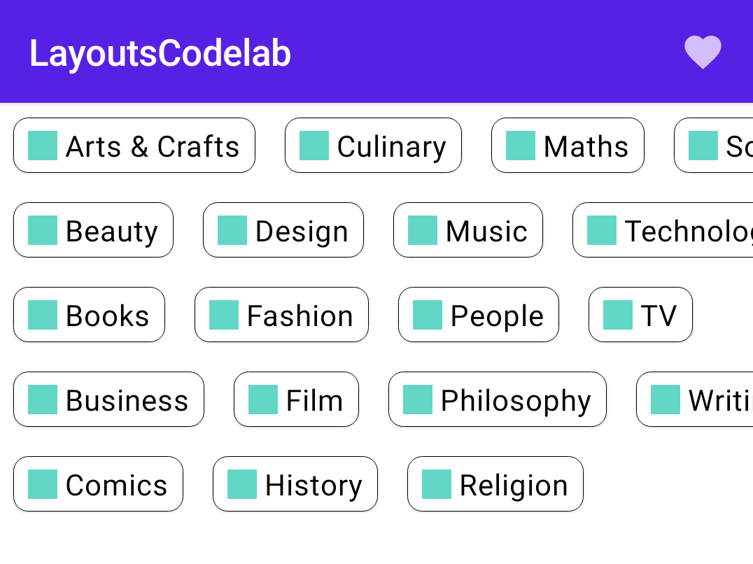
Complex custom layout

- 다음과 같은 복잡한 레이아웃(staggerd grid layout)을 구성하기 위해 Column과 Row만으로는 불가능하다. 레이아웃의 staggering(지그재그)을 표현할 수 없기 때문이다.
- 그래서 이런 복잡한 레이아웃도 위에서 배웠던 custom layout을 사용하여 표현할 수 있다.
- 자식을 오직 한번만 측정할 수 있음을 기억하자.
@Composable
fun Chip(modifier: Modifier = Modifier, text: String) {
Card(
modifier = modifier,
border = BorderStroke(color = Color.Black, width = Dp.Hairline),
shape = RoundedCornerShape(8.dp)
) {
Row(
modifier = Modifier.padding(start = 8.dp, top = 4.dp, end = 8.dp, bottom = 4.dp),
verticalAlignment = Alignment.CenterVertically
) {
Box(
modifier = Modifier
.size(16.dp, 16.dp)
.background(color = MaterialTheme.colors.secondary)
)
Spacer(Modifier.width(4.dp))
Text(text = text)
}
}
}
val topics = listOf(
"Arts & Crafts", "Beauty", "Books", "Business", "Comics", "Culinary",
"Design", "Fashion", "Film", "History", "Maths", "Music", "People", "Philosophy",
"Religion", "Social sciences", "Technology", "TV", "Writing"
)
@Composable
fun BodyContent(modifier: Modifier = Modifier) {
Row(modifier = modifier.horizontalScroll(rememberScrollState())) {
StaggeredGrid {
for (topic in topics) {
Chip(modifier = Modifier.padding(8.dp), text = topic)
}
}
}
}
@Composable
fun StaggeredGrid(
modifier: Modifier = Modifier,
rows: Int = 3,
content: @Composable () -> Unit
) {
Layout(
modifier = modifier,
content = content
) { measurables, constraints ->
val rowWidths = IntArray(rows) { 0 }
val rowHeights = IntArray(rows) { 0 }
val placeables = measurables.mapIndexed { index, measurable ->
val placeable = measurable.measure(constraints)
val row = index % rows
rowWidths[row] += placeable.width
rowHeights[row] = Math.max(rowHeights[row], placeable.height)
placeable
}
val width = rowWidths.maxOrNull()
?.coerceIn(constraints.minWidth.rangeTo(constraints.maxWidth)) ?: constraints.minWidth
val height = rowHeights.sumOf { it }
.coerceIn(constraints.minHeight.rangeTo(constraints.maxHeight))
val rowY = IntArray(rows) { 0 }
for (i in 1 until rows) {
rowY[i] = rowY[i - 1] + rowHeights[i - 1]
}
layout(width, height) {
val rowX = IntArray(rows) { 0 }
placeables.forEachIndexed { index, placeable ->
val row = index % rows
placeable.placeRelative(
x = rowX[row],
y = rowY[row]
)
rowX[row] += placeable.width
}
}
}
}
@Preview
@Composable
fun ChipPreview() {
BasicCodelabTheme {
BodyContent()
}
}
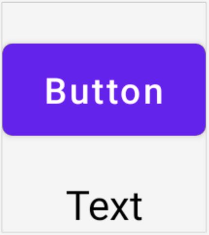
Constraint Layout
- 컴포즈에도 Constraint Layout이 있다. 기본 레이아웃보다 더 복잡한 레이아웃을 구현할 때 유용하다.
- createRefs() 또는 createRef() 메서드를 사용하여 Constraint Layout의 연결할 수 있다.
- constraintAs라는 modifier를 사용하여 제약 조건을 지정할 수 있도록 한다.
- linktTo를 사용하여 제약 조건을 지정한다.
- parent는 Contstraint Layout에 대한 제약 조건을 지정하는 데 사용할 수 있는 기존 레퍼런스.
@Composable
fun ConstraintLayoutContent() {
    ConstraintLayout {

        // Create references for the composables to constrain
        val (button, text) = createRefs()

        Button(
            onClick = { /* Do something */ },
            // Assign reference "button" to the Button composable
            // and constrain it to the top of the ConstraintLayout
            modifier = Modifier.constrainAs(button) {
                top.linkTo(parent.top, margin = 16.dp)
            }
        ) {
            Text("Button")
        }

        // Assign reference "text" to the Text composable
        // and constrain it to the bottom of the Button composable
        Text("Text", Modifier.constrainAs(text) {
            top.linkTo(button.bottom, margin = 16.dp)
            // Centers Text horizontally in the ConstraintLayout
            centerHorizontallyTo(parent)
        })
    }
}
Intrinsics
- 계속 강조하는 부분이 컴포즈는 자식을 한 번만 측정해야 한다는 것이다. 두 번 측정할 경우 런타임 에러가 발생한다.
- 그러나, 자식을 측정하기 전에 정보가 필요할 경우가 있다.
- 이때, Intrinsics가 실제로 측정되기 전에 쿼리에 대해 알려주는 역할을 한다.
- intrinsicWidth와 intrinsicHeight를 통해 너비와 높이를 알아낸다.
@Composable
fun TwoTexts(modifier: Modifier = Modifier, text1: String, text2: String) {
    Row(modifier = modifier.height(IntrinsicSize.Min)) {
        Text(
            modifier = Modifier
                .weight(1f)
                .padding(start = 4.dp)
                .wrapContentWidth(Alignment.Start),
            text = text1
        )

        Divider(
            color = Color.Black, modifier = Modifier
                .fillMaxHeight()
                .width(1.dp)
        )
        Text(
            modifier = Modifier
                .weight(1f)
                .padding(end = 4.dp)
                .wrapContentWidth(Alignment.End),
            text = text2
        )
    }
}